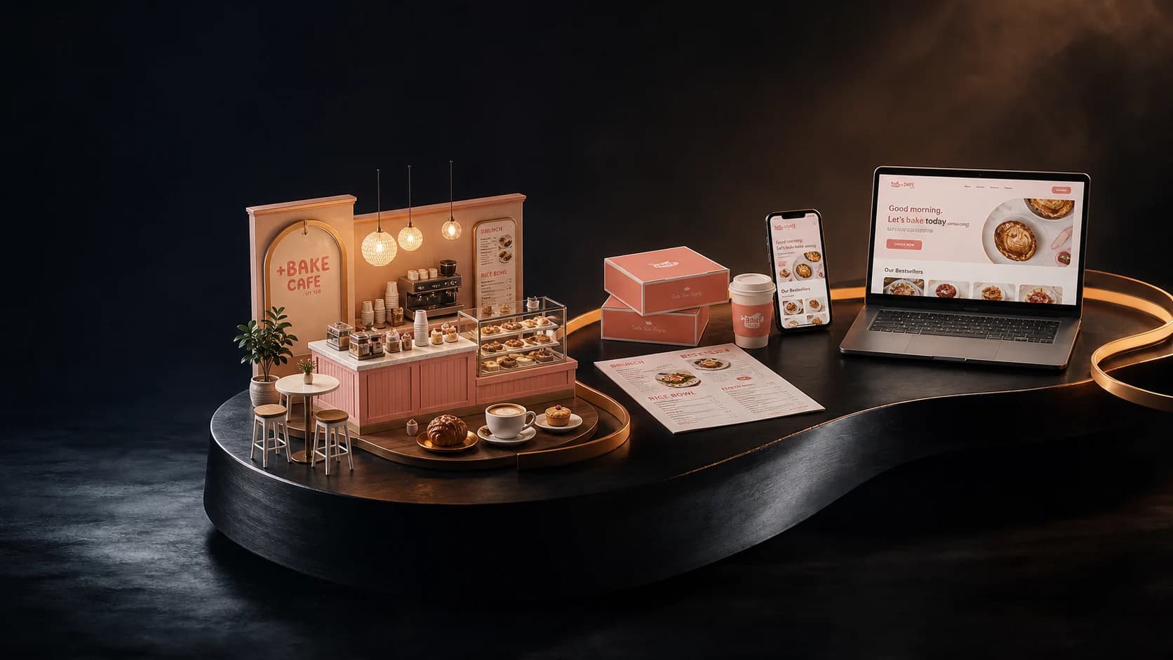
One brand became three concepts, from a single hand.
Take Ur Seat is a brunch restaurant brand and the flagship of a growing family of concepts. MIU works with the team across identity, menus, campaigns, and in-store screens so every surface comes from one standard.
- Client
- Take Ur Seat
- Industry
- Hospitality and food
- Location
- Ontario, California
- Engagement
- In-house creative team, since 2022
- MIU role
- Brand standards, menus, campaign creative, social, in-store screens
- Timeline
- Ongoing
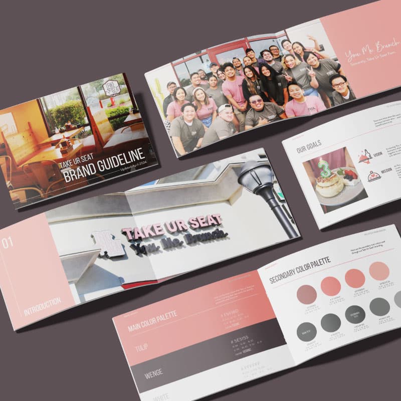
What was happening in the business
The brand had to work in more places than it was originally drawn for. A flagship restaurant, a lite format, and a cafe concept each needed menus, campaign creative, signage, social content, and screens behind the counter, and each was being produced as a separate request.
What the evidence showed
Reviewing the surfaces together showed the same brand rendered differently depending on who produced the piece and when. Print, embroidery, screen, and daylight each pulled the mark in a different direction, and seasonal campaigns were being redrawn from scratch rather than run from a template.
Data-gap statement
The client did not have a reliable baseline for guest response by campaign or by channel. MIU treated this as a measurement gap rather than claiming a result that could not be verified.
What was getting in the way
The priority problem was not the design of any single piece. It was that no shared standard existed for how the brand should be reproduced, so every new request restarted the decision.
What we chose to change
Build the identity to survive its hardest reproduction first, embroidery and daylight signage, so every easier surface follows automatically.
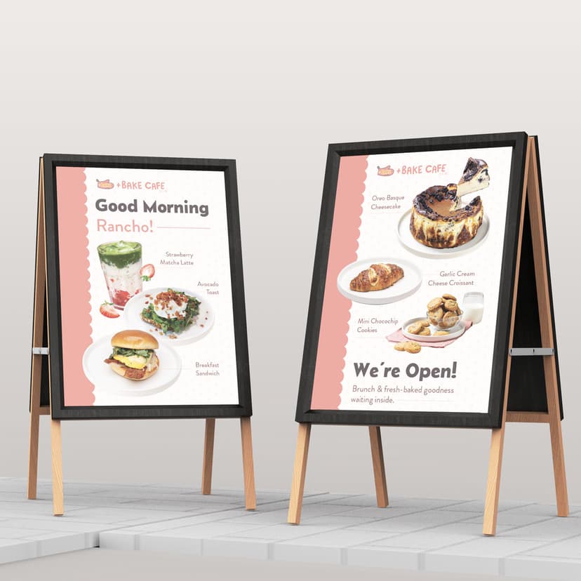
Template the recurring work, menus, campaign flyers, and TV boards, so the seasonal calendar becomes production rather than redesign.
Keep the concepts visually distinct while sharing one production standard, so the lite format and the cafe do not read as the same restaurant.
What we did not do
We did not rebuild the mark itself, because the existing equity with regulars was worth more than a cleaner drawing.
What changed
Every claim carries one of four honesty labels. Nothing here implies causation the evidence does not support.
- Observable change
Menus, campaigns, social posts, and in-store screens now ship from one standard rather than being drawn per request.
- Observable change
Seasonal campaigns run to the calendar, with flyers and signage prepared ahead of each date rather than during it.
- Still being measured
Guest response by campaign and channel is not yet baselined. The next step is to agree on one indicator per campaign and review it after the season.
What we would repeat
Designing for the hardest reproduction first. Once the mark held on embroidery and on a sunlit sign, every other surface stopped being a negotiation.
More case studies

Start with the Score, or tell us what has changed in your business.
The Score points at the dimension most likely to be limiting your current priority. A diagnostic examines it in context.